Colour Contrast and Accessibility
The other day I was implementing a sign-up form that included a button with white text on a red background. As I usually do when I complete a site, I ran it through Lighthouse to ensure everything was good. I got 100 on everything, except for accessibility where I scored 99.
The culprit was that button, which had a contrast rating of 4.35 - well below the threshold of 4.5 required for WCAG2 compliance. One way to make it pass, was to change the text colour to black, which brought it just above the 4.5 passing grade:
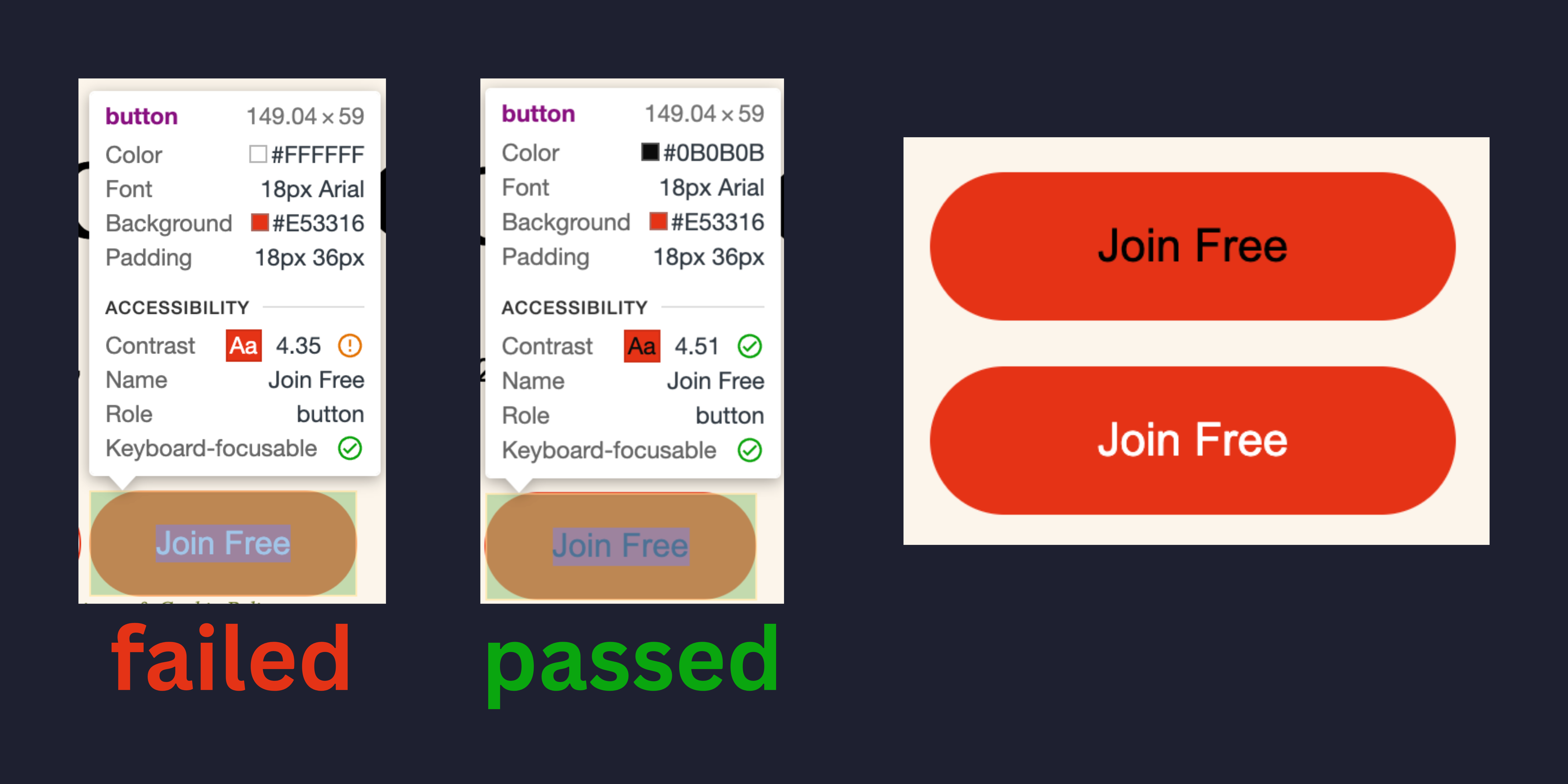
To me, however, that button was now significantly harder to read than white on red. What gives? I asked on Mastodon, where several people confirmed that they also found the original button easier to read.
So what’s going on? My first thought was that this might have to do with colour blindness. But the contrast rating provided by Chrome, is just that: A contrast between the background and foreground colour. It doesn’t take colour blindness into account.
@[email protected] had the first clue: Generally speaking, we find it harder perceive contrast of black on red, than white to red, even when the physical contrast is the same. I find that sort of stuff fascinating in itself.
Then @[email protected] pointed me to an amazing article on Smashing Magazine The Realities And Myths Of Contrast And Color which basically confirmed that colour contrast as it’s currently referenced by WCAG 2 to establish accessibility guidelines, is simply concerned with the physics of contrast: how many photons are emitted by the background vs foreground colour. But our human perception works differently, as we perceive different colours differently. So simply going for scores here, is not enough. I really recommend reading the whole article!
So what’s the takeaway? Is it wrong to aim for a 4.5 contrast ratio? Certainly not. Is it wrong to want a Lighthouse score of 100? Also no. But don’t follow the number blindly: it measures photons, not perception. Check the result with your own eyes as well.
The fix that satisfies both is to darken the red until white text clears 4.5. The button stays readable and the check passes. I couldn’t do that here, because the red is the brand colour and isn’t mine to change. So the honest position is that this button doesn’t meet WCAG 2 yet, and the fix is a conversation with whoever owns the brand palette - not a black label that games the score whilst making the button harder to read.
Which leaves me on 99 for now. I’d rather have the open issue than the false pass.
What do you think?